The pie chart below shows the proportion of different categories of families living in poverty in UK in 2002.
Write at least 150 words.
Proportion of people from each household type living in poverty
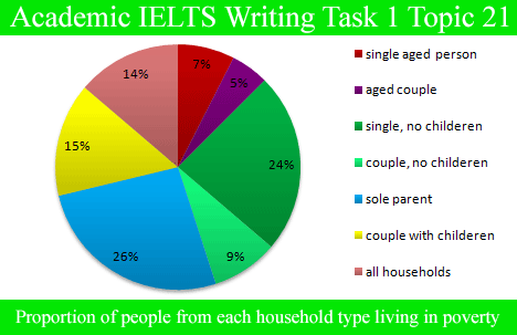
At a glance, in the given year, 14% of the entire households in the country were in circumstances of poverty. In comparison to the couples, singles struggled more. Considering people with children, single parents presented the maximum percentage of 26% amongst all the specified categories, whereas couples with children reported a comparatively lesser percentage of 15%.
As far as the people with no children are concerned, single people were of the hefty percentage, 24%, almost the same number for single people with children. On the contrary, merely 9% of the couples without any children agonized from poverty in 2002. Coming to aged people, singles had a somewhat higher percentage in comparison to couples. Only 7% and 5% of the aged population had difficulties in their living conditions.
Comments
Post a Comment