The pie charts below show the percentage of housing owned and rented in the UK in 1991 and 2007. Summarize the information by describing the main features of the charts and making comparisons where appropriate.
Write at least 150 words.
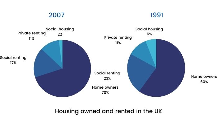
On the contrary, in 2007, the number of homeowners had upsurged to 70% or almost three-quarters of all homes. Most of the increase in homeownership can be explained by the decrease in social rented homes, which had dropped to 17%.
The percentage of houses privately rented stayed consistent and unchanged at 11%. However, compared to 1991, in 2007, there were 5 million more homes. From 1991 to 2007, the number of social housing had decreased three-fold from 6% to 2%, thereby being the least popular type of housing.
Comments
Post a Comment