The pie charts show the average consumption of food in the world in 2008 compared to two countries; China and India.
Write at least 150 words.
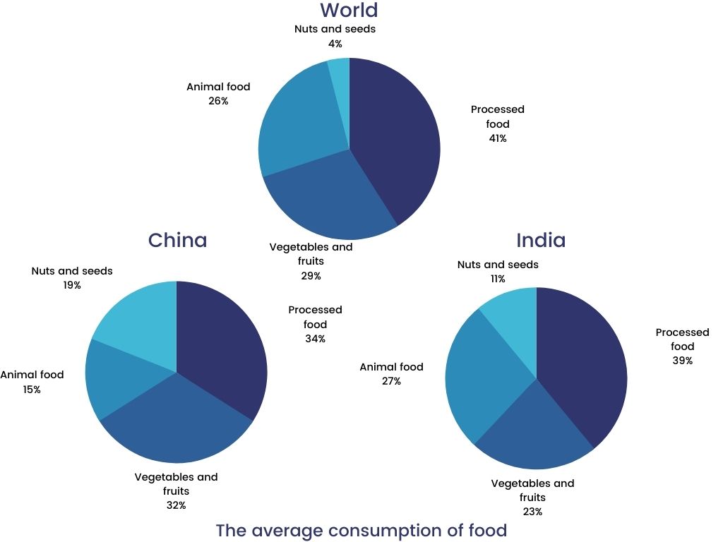
The pie charts reveal the consumption of four food types across the globe in year 2008. The figures compare the amounts of food utilised in China and India in the same year.
it can be seen, the consumption of processed food was the highest in the world, accounting for 41%, followed by vegetables and fruits at 29% and animal food at a quarter. However, the intake of nuts and seeds constituted 4% only .
Likewise, China consumed 39% of the processed food, making it the one with the largest proportion. Animal food exhibited an identical figure, which is similar to the world’s average of 25%.The popularity of vegetables and fruits was at 32%, while nuts and seeds were consumed less than a quarter.
In India, both vegetable and processed food were used the most in 2008 with 34% and 32% successively. Nuts and seeds' preference in this nation depicted the largest proportion among the three given charts, making up 19%.
Overall, the two nations presented dissimilar patterns of food consumption as compared to the average of the world. However, processed food consumption had the largest shares of percentages among all other food types.
Comments
Post a Comment